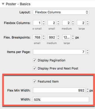
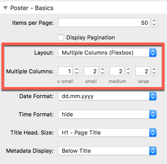
Flexbox Column Layout
By default, as known from the RW blog plugin, the items are displayed all below each other. Poster Stack allows a multiple column layout. The media query break points are:
- x-small: below 768px
- small: greater/equals 768px
- medium: greater/equals 992px
- large: greater/equals 1200px
Only in flex layout, the option for a featured item is available, spanning an item over the full width.
It is designed to place the header content area (most probably an image) in the left part of the item, and the summary in the right part.
It is designed to place the header content area (most probably an image) in the left part of the item, and the summary in the right part.